


Highlights
The problem: Mr. Muggles’ Dogs needs an updated homepage and an online Meet and Greet booking feature to show potential customers who have never used dog daycare and boarding the value and benefit of using these services and to increase their number of Meet and Greet bookings.
The process:
Discovery – analysis of current homepage, defining the users’ problems, proto-persona, competitive analysis of other dog daycare websites
Design – rapid ideation techniques (crazy 8s), user persona, layout sketches, wireframes, user tests and analyses
Delivery – style guide, high fidelity prototype of redesigned homepage and Meet and Greet booking feature
The solution: Incorporating Mr. Muggles’ existing brand identity, created a new homepage showcasing their services, Meet and Greet CTAs, benefits of using their services, information about the staff and facilities, and customer reviews. Designed and prototyped an easy to navigate and complete Meet and Greet booking feature that produces a confirmation detailing what the customer can expect, what they need to prepare and bring, and what will happen during the Meet and Greet.


Project Details
Type: This was a solo design challenge as my capstone student project to complete my UX Design Certificate of Achievement at Skyline College. Mr. Muggles’ Dogs was not involved in any way.
Duration: I worked on this project from February — March 2024 and then again from June — July 2024.
My role: I was the sole UX Designer throughout this project from planning and ideation to delivery of final requirements with the help of feedback and guidance from my classmates, friends, and professor.
The Deep Dive
Gathering Information
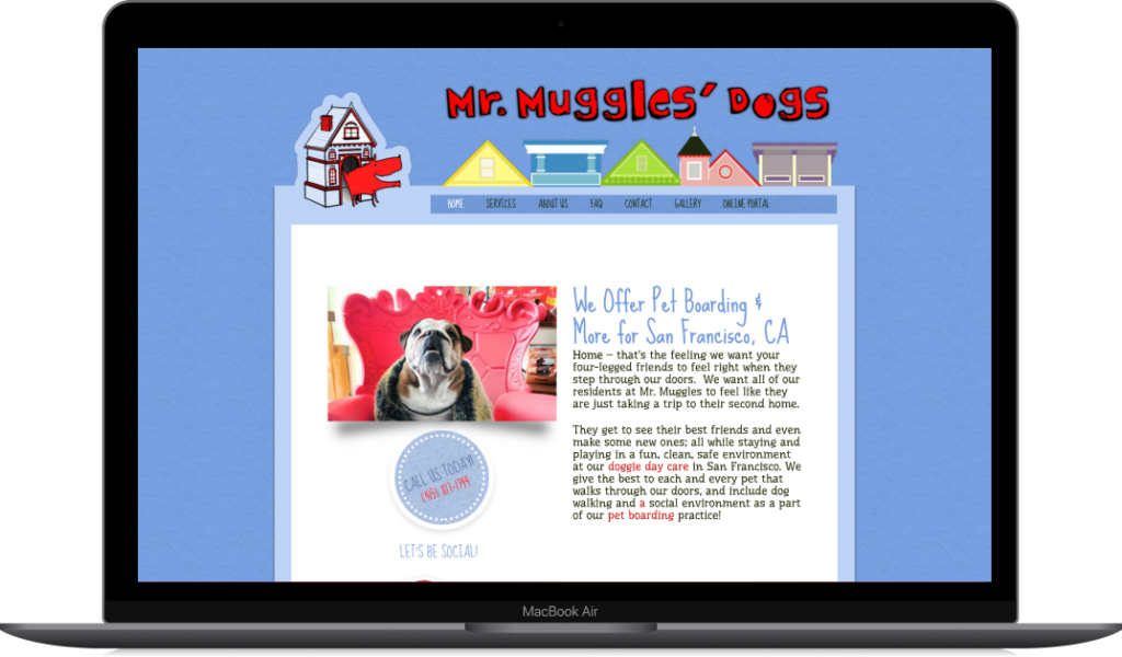
My first step in this design process was to analyze Mr. Muggles’ Dogs current homepage and identify any areas of opportunity and improvement. I also conducted an analysis of homepages of other dog daycare and boarding services in the Bay Area to see how they may have addressed some missing elements from Mr. Muggles’ homepage.
My main takeaways were that the homepage needed a Call to Action button to book a Meet and Greet as well as an all around update of the design to showcase the services offered, features and benefits, and their trustworthiness.

Brainstorming and Ideation
Having been bombarded with all this information, I needed to narrow my focus. Based on my own assumptions about dog owners, I first created a proto-persona to get a better sense of Mr. Muggles’ target customer, listing out their behaviors as it would relate to how they care for their dog, their motivations, and pain points they have when it comes to deciding on a dog daycare facility.

To quickly kickstart some layout ideas, I did two rounds of Crazy 8 sketching. I included a Call to Action button on each sketch and experimented with different ways to include images and more information about services offered, the Meet and Greet process, customer reviews.
Sketching and Wireframing
After some feedback from my professor, I reframed my thinking and sketched out three distinct homepage layouts, each one with a different theme and focus.
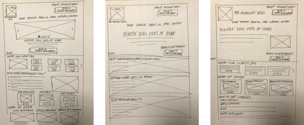
The first had a dense layout, more images, and a focus on customer reviews and benefits. The second had a more bold use of images with less text and a minimalist layout focusing on staff expertise over customer reviews and benefits over features. The last was not quite as dense a layout as the first nor as minimal as the second and focused on customer reviews and features.
I then translated these to low fidelity wireframes in Figma.

After receiving more feedback, I was ready to create my high fidelity wireframes.
The second layout needed the most work since it became apparent that having images span the whole screen would simply not be feasible for the entire page. I had to come up with another way to bring focus to the images.

User Tests
I scheduled three user tests and prepared my testing materials, a testing guide with my interview questions, and my Figma high fidelity wireframes.
After my tests I created a user test debrief document synthesizing all I had learned. I also created a User Feedback Capture Grid & Affinity Map in Figma for all my positives, negatives, and neutrals.


These were my conclusions:
1. Explore a design with clearly defined sections that incorporates a combination of images and text and focuses on providing as much information as possible. Home page should include: services offered, staff and facility information, how to get started, what to expect, customer reviews, prominent CTA button.
When only some of these items were included in the design, test participants wanted the others added as well.
2. Explore a design that merges both a warm, cosy, and inviting feeling using images while maintaining a well organized layout and structure that includes all the information listed above. Text should be informative but minimal. Images could link sections together instead of keeping each one separate, creating more of a continuous flow as the visitor scrolls down the page.
The second layout gleaned positive responses primarily because of the bolder use of images from the other two designs. However, it didn’t include as much information as the other designs which some participants preferred to have.
New Design Direction — Round 2!
Given all I had learned, I then went through my second round of ideation and design. I created a new proto-persona, did two more rounds of Crazy 8s ideation, and put together a high fidelity wireframe of my best homepage redesign.

But my work was not yet done. Naturally. What designer ever thinks their work is done?

Adding Visual Style
Now that I had my layout nailed down, it was time to create a style guide for Mr. Muggles’ Dogs.
I first had to break down the current website into brand elements
- Color palette
- Graphic elements
- Tone of Voice

I then interpreted these dimensions and showed how I planned to expand and elevate each
- Show additional colors based on the original color family
- Show snippets of graphics that marry contemporary style with homey illustrative style
- Write a few key statements in the same voice
Once these steps were done, I put together a style guide.

I could now better align my homepage redesign with the Mr. Muggles’ Dogs brand, but there was still one more thing to do.
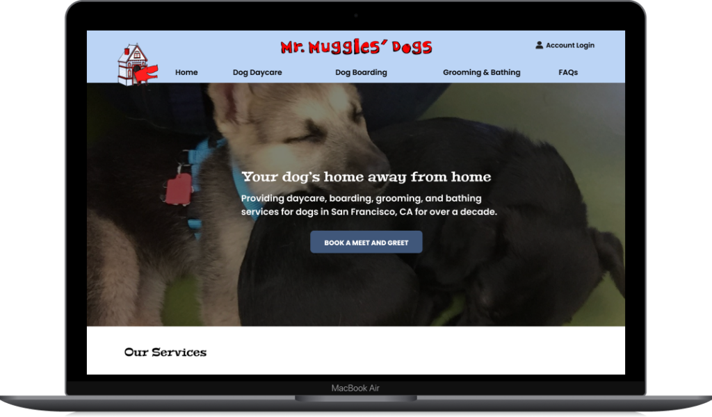
My work thus far had focused on redesigning the homepage. The new layout showcased the services offered by Mr. Muggles’ Dogs as well as listing the benefits of using their services and displaying trustworthiness by way of customer reviews, staff information, and lots of photos of happy dogs.
But what about the online Meet and Greet booking feature?
We’ve now entered the next phase of our journey.
Design the Meet and Greet booking feature
There was some groundwork I needed to lay before jumping into designing this feature.
Competitive Analysis
I selected two websites with booking features to break down and analyze: Petcamp.com, a pet care facility in San Francisco and Lovejoystearoom.com, a tea room also in San Francisco.


Top 3 Takeaways
1. Petcamp’s form is pretty straightforward and easy to understand (except for the lack of clarity regarding deleting and changing vaccination document uploads), but a reservation won’t be confirmed until all the information has been submitted and reviewed with no indication of how long that process will take.
2. Lovejoy’s/Resy does a great job of listing available days and times and provides a lot of useful information on their reservation pop-up, but because Resy is a 3rd party vendor, the user has to jump through a few hoops to complete the booking, including entering their cell phone number or logging in with an email and password. However, the booking is confirmed as soon as all information is submitted and an email confirmation is automatically sent out.
3. Online booking should involve an easy way for the prospective client to select a day and time and receive their booking confirmation as well as a hassle free way of providing pertinent information. A combination of the first two flows seems ideal.
More sketching!
Armed with this new knowledge, I sketched the happy path flow for my own booking feature and sought more feedback.

Prototyping
I took my style guide and all the great feedback I received and used those for my first prototype.

I submitted this prototype for more feedback, and I can admit that choosing that beige color instead of the light blue from the color palette in my style guide was an embarrassing misstep. One I have since corrected.
The Solution
And now the moment we’ve all been waiting for, my final deliverables.
A fancy new style guide!

An updated homepage and a new booking feature happy path flow.

I also added uploading vaccination and spay/neuter documents as its own section and adjusted the layout above the fold in the homepage to make the text easier to read against the background of puppies cuddling.
Recap
The two business goals for Mr. Muggles’ Dogs were:
- To show potential customers who have never used dog daycare and boarding the value and benefit of using these services.
- To create an easy online Meet & Greet appointment feature to increase their number of these bookings.
The four user goals were:
- To understand the value of using dog daycare and boarding when dog owners are away from home
- To assuage any fears and anxieties over their dog’s socialization needs and care while at Mr. Muggles’
- To be well informed about what they can expect at a Meet & Greet and what they need to prepare and bring
- To have an easy online Meet & Greet booking experience
My homepage redesign stays true to Mr. Muggles’ Dogs brand identity and showcases not only the services they provide but all the information a user will need to be well informed and reassured about the business, its practices, and its trustworthiness.
Through the images of happy dogs, capable and caring staff, and clean and spacious facilities, and the content detailing what to expect from the business, how to get started, customer reviews, and information about the staff and facilities, users will have a very clear idea of the value and benefit of not just using dog daycare and boarding services in general, but in trusting Mr. Muggles’ Dogs for these services.
The booking feature I designed provides an easy and straightforward way for users to book a Meet and Greet online. There are three prominent CTA buttons on the homepage which takes the user directly to the booking page.
The Meet and Greet booking feature requires one form on one page with only four required sections and produces a printable booking confirmation at the end. That confirmation also details what dog owners can expect and what’s required of them when they arrive for their Meet and Greet, making the information easily accessible via email or their print out.
Results
Top three things I learned, in no particular order:
- Exhaust my options before chucking something out.
In the first iteration of my homepage prototype, I had decreased the opacity of the photos of the cuddling puppies and overlaid the black header and sub-header text. This did not make for very good reading. I considered opting for a different layout all together before realizing that the proper way to achieve that text overlay effect is to leave the photo as is but add a dark layer on top of that with an adjusted opacity and add white text on top of that. Works so much better and saved me from having to change the design. - Always seek out other perspectives.
I’d like to think that if I were working on a team on this instead of solo, my whole team would not have allowed me to use that beige color for the headers and footers. Additionally, I received so much great feedback about things to add or remove, things that never even occurred to me at the time. - It’s okay to copy.
If something works well, use it. There were a lot of elements both in the homepage and in the booking feature that were inspired by other websites. As many professionals have said, “Don’t even try reinventing the wheel!”
So, what now?
Now I cuddle up and sleep with my cat for 16 hours straight. But after that, it’s back to work. Practice makes progress!
Yes, I’ve done a lot on this project, but as always, there is still more work to be done. This revised homepage and booking flow need some user testing and another round of ideation after that. Perhaps, if I find myself feeling particularly bold, I’ll reach out to Mr. Muggles’ Dogs and offer to show them what I’ve designed.